


Mike Danch doesn’t remember any.
Bubba Cunningham can’t recall any.
Kevin White has no recollection of any either.
Ask almost anyone connected with University of Notre Dame athletics in recent decades — especially those charged with oversight of Notre Dame Stadium and Irish athletic facilities — and they are hard-pressed to remember anyone seriously suggesting any changes with the on-field markings and approach.
Danch (a Notre Dame graduate) retired two years ago after more than four decades at Notre Dame, most of it working in athletics and most of those years overseeing Irish facilities. In particular, he served many years as the game day manager for Notre Dame home football games.
“I don’t recall any serious discussions,” he says.
Cunningham worked for 15 years at his alma mater in a variety of senior administrative roles in marketing and finance for Notre Dame athletics. He’s now the director of athletics at the University of North Carolina.
“Very little discussion about field markings,” he says.
White served as director of athletics at Notre Dame from 2000-08. He’s now in that same capacity at Duke University.
“Zero conversation with anyone about the logo, that I can recall,” he says.
When Notre Dame Stadium — a creation of Knute Rockne that rivaled any of his championship football teams — opened in 1930, its aesthetics jumped out at fans and visitors for their simplicity.
Long before college football programs emblazoned their logos and school names in bold capital letters in their end zones, Notre Dame selected another path.
The 1930 version of Notre Dame’s home football facility featured more than 30 closely bunched diagonal lines in each end zone.
And that was it. There was nothing else.
For decades the rest of the views within Notre Dame Stadium featured the same approach.
There has never been any advertising or corporate signage permitted.
The University previously acknowledged one of its media partners with a Mutual Radio sign on the front of the old west-side press box — and the old brick scoreboards featured an NBC logo on the south end for some number of seasons.
Old-timers will remember the clocks on the end zone scoreboards with the Longines name displayed.
Nearly nine decades later, not all that much has changed.
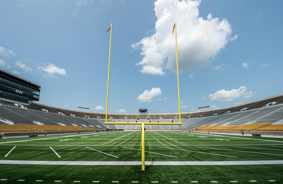
After 84 seasons of playing on grass, the Irish traded that in for more consistently dependable FieldTurf beginning in 2014 — and with it came an ND monogram (blue trimmed in gold) at midfield. Even that monogram is less than 10 yards wide.
The 35-yard-line marks for kickoffs include small green shamrocks.
And that’s about it from a branding standpoint.
One of the few prior exceptions came in 1992 when the University placed its sesquicentennial logo on the field.
Those simple diagonal lines in the end zone? They are still there — only fewer of them and for good reason.
Recent decades featured 10 diagonal lines in the end zones.
The FieldTurf included nine at each end — combining for 18. They all are positioned at a 42-degree angle toward the gold dome atop the Main Building and the Basilica of the Sacred Heart.
Do the math and all that equates to 1842, the year the University was founded.
With many of the main concourse improvements a year ago marking nods to Notre Dame’s unique history and tradition, the field markings qualified, too. And so a strong sense of history permeates the look of the field and its markings.
“The interlocking ND is the most recognized symbol of our University and its athletics programs. We wanted to communicate that to our fans and all those viewing our home games on NBC,” said Notre Dame vice president and James E. Rohr athletics director Jack Swarbrick at the time.
“The integration of the shamrocks allows us to achieve consistency across all of our new or recently renovated facilities where both the interlocking ND and a shamrock have a presence on the playing surface.
“While being careful to maintain the look and feel of the original Rockne bowl, we are using this opportunity to make sure that every visual element of the field is carefully considered and helps to celebrate our University and its rich traditions.”
Notre Dame along the sidelines included Irish coastal grasses with bright yellow mum plantings, as well as the application of appropriate color pantones and theming to sideline equipment, pylons and yard markers.
Still, many aspects of the interior of Notre Dame Stadium smack of a yesteryear approach. It was only in 2017 that a video board appeared at the south end of the field. The University maintains a philosophy prohibiting advertising and signage in the stadium.
All that equates to more reasons to pay attention to what happens on the field. It’s the game that counts — so the University for decades has offered minimal distractions from that, until the video board addition a year ago.
Adds White: “During my tenure, being ultra-traditional, as well as highly conservative, was indeed the theme of the day.”
Current Notre Dame senior deputy athletics director Missy Conboy, who worked closely day to day with all the Campus Crossroads changes and additions for the 2017 season, also was a key player when the Irish staff determined the design for the FieldTurf:
“I worked with Jack (Swarbrick) to develop a number of options for the field,” she says.
“Similar to the exercise with the basketball court, we wanted to review a spectrum of options, ranging from very traditional, to something more complex. We reviewed old photos from Notre Dame home games and from bowl games that Notre Dame participated in through the years. Because all of our games are on television, we discussed the lost opportunity to celebrate our mark if there was no logo in the center of the field.
“We also considered the ND within a shamrock, similar to what we had in basketball and hockey at the time, as Jack felt there might be some value in having a more standard playing surface design for all of our sports. We also looked at leaving the middle of the field clear, potentially adding Notre Dame in the end zones — and we considered a variety of fonts, including Art Deco to match the concourse to the Leahy font used in more current theming projects.
“I worked with (creative and brand program director in athletics) Tim O’Connor to develop the options for Jack to consider. We went back to photos to see if there was consistency in the number of lines in the end zones. O’Connor gets full credit for coming up with the suggestion that we use those marks to celebrate our historical beginnings — 18 lines at 42 degrees tied to the year Notre Dame was founded. In addition, Tim suggested that the lines in the north end zone slant toward the student body.
“Despite reviewing myriad designs, we landed back very close to where we started. We had a great story in the end zones to tie to the founding of the University, and the simple ND made it easy for fans to recognize our broadcasts.
“Finally, we did add two small shamrocks at the kickoff spots to add a level of interest, and the subtle use of the shamrock was consistent with other venues. The fans in the stadium don’t typically notice it, but when a tight kickoff shot comes into the frame, it is a fun surprise.”
Cunningham remembers the stadium gates — beginning with the 1997 renovation — replicating the field with those same angled stripes.
“I only remember the 150-year logo,” he says.
“We tried a couple times to create a logo with the lawn mowers like you see in baseball.
“I think we lost and so we had to stop trying that.”
Danch recalls the discussions of the end zone striping — but not much else.
Visitors to Notre Dame Stadium might want to take note of the conservative approach on view today.
It might not be found quite this same way anywhere in college football.
John Heisler, senior associate athletics director at the University of Notre Dame, has been part of the Fighting Irish athletics communications team since 1978. A South Bend, Indiana, native, he is a graduate of the University of Missouri School of Journalism and a member of the College Sports Information Directors of America Hall of Fame. He is editor of the award-winning “Strong of Heart” series.